Developer
Tamara Marnell, Orbis Cascade Alliance
Description
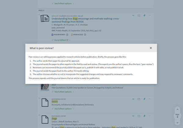
Add icons beside the peer review and open access badges for article results that, when clicked, display modal windows with explanatory information.


System Components
Alma Discovery Configure Views
Skillset Requirements
Alma Discovery Configure Views, JS, and CSS
Accessibility
Button has Aria labels, but has not been tested for accessibility
Browser Support
Tested on Chrome, Firefox, and Edge
Mobile Support
Tested on Android phones
Implementation
Overview
To enable this module, you will need to…
- Declare the module and options in your custom.js file (steps 2 through 4)
- Add the contents of the modal windows as files in your html directory (step 5)
- Style the icon buttons in your custom1.css file (step 6)
Steps
- Turn on inheritance from the Central Package.
- In your local package, in the custom.js file, include the module ‘badgesModal’ in your app definition. For example:
var app = angular.module('viewCustom', ['badgesModal']); - Also in the custom.js file, add the following line of code within the anonymous function (that is, before the closing brackets at the end of the file):
app.component('prmIconAfter', { template: '<badges-modal />' });
If you’re also using the login warning for favorites module, place both tags in the same prmIconAfter component.
Note: do not use self-closing tags.app.component('prmIconAfter', {template:'<badges-modal></badges-modal><fav-overlay></fav-overlay>'}); - If you want to customize the display of the icons, add the following block of code within the anonymous function and edit the values.
app.value('badgeOptions', {
  info_icon: "primo-ui:help-circle-outline",
  peer_review: {
    show_icon: true,
    tooltip: "What is peer review?"
  },
  open_access: {
    show_icon: true,
    tooltip: "What is open access?"
  }
});
In “peer_review” and “open_access,” configure if and how you want the icons for these badges to display. For example, to show the icon for Peer Review badges but not for Open Access badges, and to change the tooltip to “About Peer Review”:app.value('badgeOptions', {
info_icon: "primo-ui:help-circle-outline",
peer_review: {
show_icon: true,
tooltip: "About Peer Review"
},
open_access: {
show_icon: false,
tooltip: ""
}
});
For “info_icon,” you can replace the default “help-circle-outline” icon with a custom choice using either of the following methods.- Select a new icon from the Material Design library. Enter a string with the set name, a colon, and the icon name like the examples below.
- For the icon “info” within the set “action,” info_icon: “action:ic_info_24px”

- For the icon “local_library” within the set “maps,” info_icon: “maps:ic_local_library_24px”

- For the icon “info” within the set “action,” info_icon: “action:ic_info_24px”
- Use a custom SVG file in your local package. To do this…
- Copy the SVG file of your icon into your local package, in the “img” folder.
- Create a new module at the top of your custom.js file to register custom icons, like this:
angular
  .module('myCustomIcons', [])
  .config(function($mdIconProvider) {
    $mdIconProvider.icon('bananas', 'custom/myViewCode/img/bananas.svg');
  })
});
In place of “myCustomIcons,” choose a name for your custom icons module.
In place of “bananas,” choose a name to represent your icon.
In place of “myViewCode,” enter the code for your Primo view (consistent with the top file name in your local package).
You can use the $mdIconProvider service in this manner to register multiple custom icons for use in modules. - Include your custom icon module in your app definition. For example:
var app = angular.module('viewCustom', ['badgesModal', 'myCustomIcons']); - Set the icon in the badgeOptions using the name you chose to represent it. For example:
info_icon: “bananas”
- Select a new icon from the Material Design library. Enter a string with the set name, a colon, and the icon name like the examples below.
- Download the following two files and move them into the “html” directory of your local package. Customize the contents with the information you want to display. The text within the header is in the node “h2”. The text within the body of the window is in the div with the class “md-dialog-content.”
- In your local package, in the custom1.css file, add the following rule-set to style the icon buttons. Customize the styles as desired.
.badgeButton {
  min-width: 0;
  min-height: 0;
  margin: 0;
  padding: 0;
  line-height: 1;
  color: #666;
  position: absolute;
  right: 0;
  top: 0;
}

.badge-item {
  position: relative;
  padding-right: 1.5rem;
} - Zip and upload your package in Alma Discovery. Save your view.
